This page should be read in conjunction with How Plume Plotter Works. It provides more details specific to the Hoddesdon version of Plume Plotter.
The plume plotter models both the proposed ERF [1] and ATT [2].
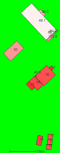
The image below (left) shows the layout of all stacks and buildings modelled. North is at the top. Numbers show the heights of buildings and stacks, in metres. Higher buildings are a lighter shade of pink. The 30m building in the west is the Rye House power station. Buildings in the north comprise the ERF while those in the southeast comprise the ATT.
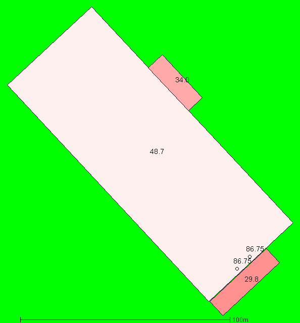
The image below (right) shows the ERF only, at a larger scale.
The ERF has two identical stacks which are modelled separately because of the large distance between them. The details of the first stack (from [1]) are:
The location of the second ERF stack is 6.2m east and 5.8m north of the first stack.
The ATT has two identical stacks which are modelled as a single stack by doubling the area and the emission rate. The details of the merged ATT stack (from [2]) are:
The following values are used for albedo, Bowen ratio, and roughness length. Roughness length is as specified in [1]:
The ERF has two identical stacks which are modelled separately because of the large distance between them. The emission rates of pollutants per stack are as given in [1], except the emission rates of dioxins and furans and PCBs, which seem to have been miscalculated in [1] as 1.75 ng/s and 87.6 μg/s, respectively. The emission rates (per stack) that we use are listed below:
| Pollutant | Emission rate per second |
|---|---|
| Oxides of nitrogen | 6.531 g |
| Particulates | 327 mg |
| Sulphur dioxide | 1.633 g |
| VOCs | 327 mg |
| Carbon monoxide | 1.633 g |
| Hydrogen chloride | 327 mg |
| Hydrogen flouride | 32.7 mg |
| Ammonia | 327 mg |
| Cadmium and thallium | 1.633 mg |
| Mercury | 1.633 mg |
| Other metals | 16.33 mg |
| Dioxins and furans | 3.27 ng |
| PAHs | 32.7 μg |
| PCBs | 163.3 μg |
The emission rate of the merged ATT stack is (2.13 x 2 =) 4.26 g/s for oxides of nitrogen [2]. We assume that all other pollutants are emitted in the same ratios as in the above table: the values above are all multiplied by 4.26/6.531.
The background levels of pollutants are taken from [1]. These are:
| Pollutant | Background concentration per m3 |
|---|---|
| Oxides of nitrogen | 23.5 μg |
| Particulates | 25 μg |
| Sulphur dioxide | 4.6 μg |
| VOCs | 500 ng |
| Carbon monoxide | 33.2 μg |
| Hydrogen chloride | 700 ng |
| Hydrogen flouride | 3 ng |
| Ammonia | 1.66 μg |
| Cadmium and thallium | 200 pg |
| Mercury | 4.4 pg |
| Other metals | 39.88 ng |
| Dioxins and furans | 26 fg |
| PAHs | 6 ng |
| PCBs | 10 pg |
The background level shown above for oxides of nitrogen (NOx) is actually the nitrogen dioxide (NO2) background level. This is because background levels of NOx are not measured in most locations.
Weather data is taken from METAR reports from a local airport: Stansted.
Upper air data is the latest reported by the Herstmonceux upper air station.
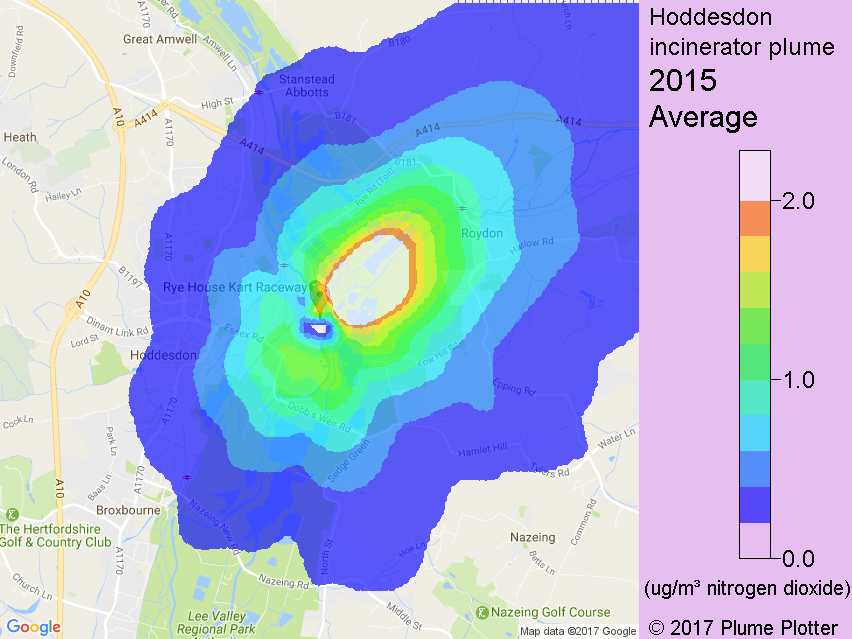
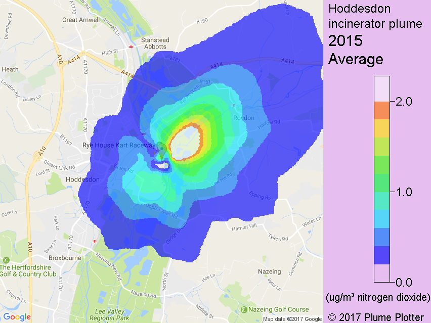
Using the details above and the 2015 weather data from Stansted airport, Plume Plotter generated this plot (below left) of the mean concentration of nitrogen dioxide for 2015. (This is calculated as 70% of the concentration of oxides of nitrogen.) The second plot (below right) shows the same thing but for the proposed ERF only. This should be compared with Figure A-3 of [1]. Clearly these two plots are very similar, suggesting the correctness of both.